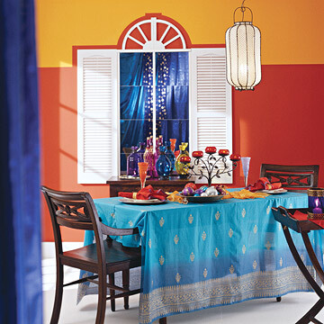
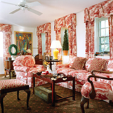
Picking new colors for a room can be difficult because it’s hard to know where to start. You can begin color selection by taking two steps: Determine the mood of the room, then decide whether you want the walls to grab attention or just serve as a backdrop for the rest of the room.

Choose a mood
Colors generate emotions; language is full of pertinent examples. People are said to be green with envy or they feel blue after suffering a disappointment. Colors have a psychological impact, so one of your first choices should be to choose colors that will help establish the mood you want for a room.
Red is bold and energetic – perfect for a room designated for activity, such as a family room or recreation space. It draws the eye toward it and makes an excellent accent.
Blue and green are passive and restful, quiet and receding, formal and fresh. Above all, they’re easy on the eyes, especially in lighter tints. That makes them a good choice for rooms, like bedrooms, designed for relaxation and sleep.
Yellow and orange are warm and cheerful. They can bring the feeling of sunshine to a space, especially a room that is shaded or has small window areas. Remember that these descriptions are general and your choices will seldom be limited to the pure hues of any color. You will more likely think about ranges of colors that could establish the kind of atmosphere you want for the room.
Focal points or backdrops?
Walls are a good place to start color selection because they are the largest area in a room. They can be the dominant design element or serve as a backdrop for the rest of the room. The choice will affect other decorating decisions.
If you want focal-point walls, pick their color first, then design the room around it. The “emotions” of a color are important, but also consider the size of the room and how much light it receives. Light colors are generally best in a dimly lit room, and dark tones work well in a well-lighted room. To make it easy, choose your favorite color and build a theme around it with contrasts, complements, and variations of intensity.
For backdrop walls, select the other major decorative elements first, including rugs and furniture. Then select a wall color that balances and complements these colors and lets them take center stage. It’s a lot easier to match a paint color to a rug or carpet than to find a carpet that matches a particular paint color. A good place to start is with a tint or shade of another color in the room or a complement of the dominant color.
Living with colors you love
If you have trouble deciding where to start when selecting colors, there’s a simple solution – pick a color you love as a starting point.
Selecting a favorite color is the least complicated method for choosing colors for a decorating project. You can pick almost anything – a pillow, a painting, a comfortable chair, a piece of clothing – with colors that are attractive to you.
You don’t need to give it a lot of thought: Why the object appeals to you really doesn’t matter. What matters is that there’s something about its color that you like or that makes you feel good.
Finding this favorite color makes the rest of your color selection easier because it gives you a reference point on the color wheel. From there you can consider the combinations. The color scheme you create this way will truly reflect your taste and not someone else’s.
Select color chips that fit into the scheme at your home center. Or use any of the paint manufacturers’ websites that feature digital color selection aids.
You can then use the colors in your palette throughout the house as you select paint colors, furnishings, and accessories.
Making connections
While it’s important to create unities of style within each room, each room should feel like it’s part of a consistent design throughout the house. Color is an effective tool for connecting rooms, especially in open-space floor plans.

For example, painting the molding throughout an open-space home the same color ties adjacent spaces together, while their different floor and wall coverings maintain the individuality of each room. Employing the same technique with built-in bookcases and cabinets in different rooms integrates the rooms, even though they are used for entirely different functions. Another way to achieve a cohesive design is to use different amounts of the same tone in different rooms or vary the tones of one color. Even though each tone is different, the fact that they originate from the same base will create a subtle unity – a definite, even if unconscious, effect.
Quick solutions with color
If you get stuck on the road to developing your color scheme, some simple steps may help get you going again.
Consider active colors such as yellow, orange, and red for rooms designated for social or entertainment activities. Yellows can jump-start your creativity, which is good for home offices and kitchens. Passive colors, members of the cool collection – blue, green, and purple – go where rest and rejuvenation are important, in bathrooms and bedrooms. Neutral colors bridge other colors. Dark neutrals tone them down, while whites make them stronger.
Monochromatic color schemes create a calm, unruffled appearance. And they’re easy to create; all you have to do is to come up with variants of the same color that mix pleasingly with one another. You’ll need some contrast, but use it carefully. Different textures and fabric patterns can work as accents too.
Although the range of colors is endless, you need only two or three, with one of those an accent color that is used sparingly. If you’re working with a monochromatic arrangement with three tones, try a really dark variation for the accent. For a complementary scheme, pick an accent from the opposite side of the color wheel. And if you’ve decided to paint the walls as a backdrop, select an accent color that goes with the furnishings.
On the other hand, if you’re painting with completely different colors, you risk the possibility of jarring contrasts. To protect yourself from this color shock, use colors of the same intensity. Most colors will work well together when they have the same or similar values.
What about white?
This all-time favorite has some drawbacks. First, manufacturers make an astounding array of whites, all different from one another. Some have noticeable color casts; make sure the one you’ve chosen goes with the other colors in the room.
Second, almost any white can dramatically alter the way other nearby colors look, a consequence you may not discover until after the paint has dried. Avoid this pitfall by using test boards for all your colors.